Lorem ipsum dolor sit amet, consectetur adipisicing elit.


1. Oswald • medium, no link
Lorem ipsum dolor sit amet, consectetur adipiscing elit, sed do eiusmod tempor incididunt ut labore et dolore magna link aliqua.
Goes in: EDU + Portal main content area • Advanced Grid Wrapper
Margin-bottom: 6rem + has margin-bottom options
Has options for:
Social Media icons to choose from:
Goes in: EDU + Portal main content area • Advanced Grid Wrapper • related 1 content + related 2 content in legacy page layouts
Margin-bottom: 6rem + has margin-bottom options
Has options for:
Note: when using the optional image overlay, make sure the image is the same width and height as the image underneath it.


Goes in: EDU + Portal main content area • Advanced Grid Wrapper • related 1 content + related 2 content on legacy page layouts
Margin-bottom: 6rem (with margin-bottom options)
Has option to add:
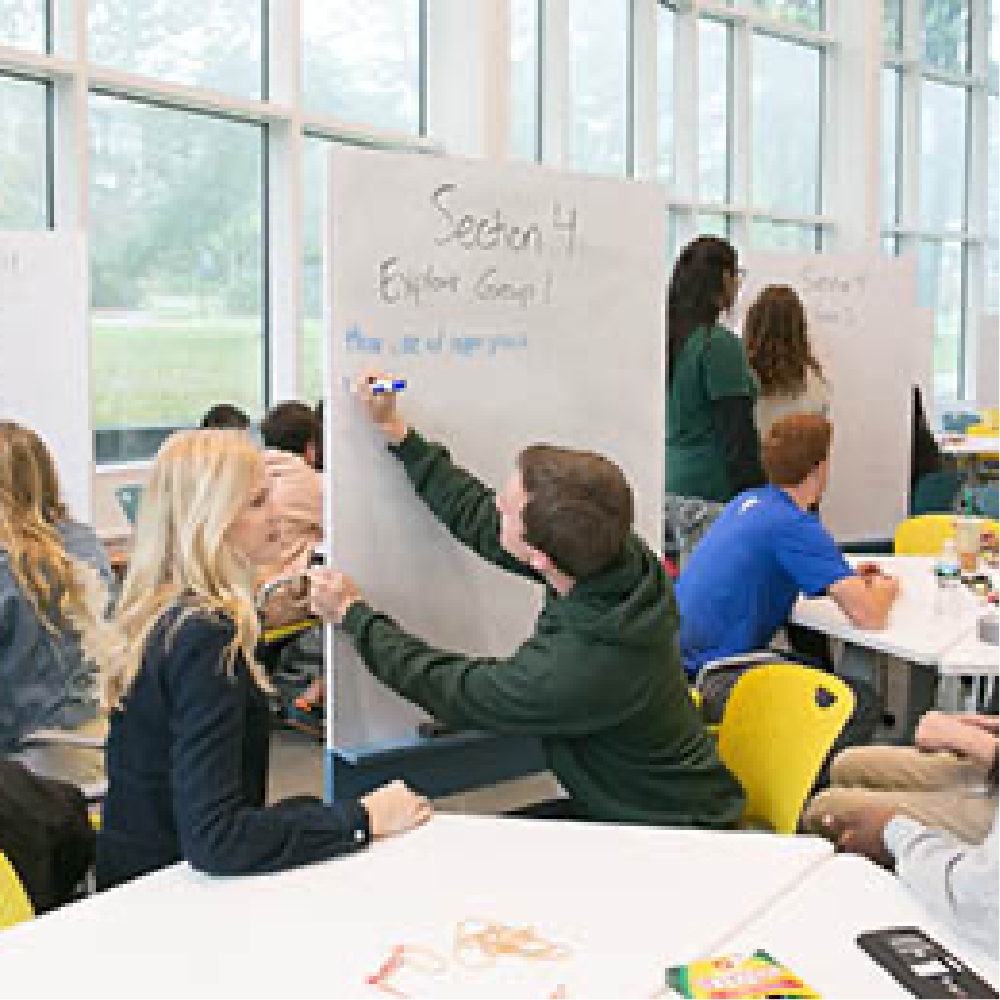
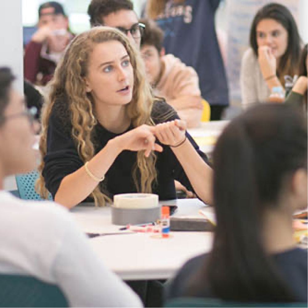
The General Content Block is a newer version of the General Content content type. The General Content Block (GCB) will ideally replace instances of General Content and Grid Item content types. It goes into the Advanced Grid Wrapper (AGW) and can add text and image. Below is an example of 4 GCBs within an AGW Link.
The General Content Block is a newer version of the General Content content type. The General Content Block (GCB) will ideally replace instances of General Content and Grid Item content types. It goes into the Advanced Grid Wrapper (AGW) and can add text and image. Below is an example of 4 GCBs within an AGW.

When adding You Tube videos to the General Content block (or the Code Content Type) place the iframe in a surrounding div with a called class="youTube-video"
Goes in: EDU + Portal main content area • Advanced Grid Wrapper
Margin-bottom: 60px (has margin-bottom options). When placed within AGW, margin-bottom should be adjusted within the AGW.
Note: do not use too long a word in a column as it will overflow out of the container
Has option for:
Lorem ipsum dolor sit amet, consectetur adipiscing elit, sed do eiusmod tempor incididunt ut labore et dolore magna link aliqua.
Lorem ipsum dolor sit amet, consectetur adipiscing elit, sed do eiusmod tempor incididunt ut labore et dolore magna aliqua.
Lorem ipsum dolor sit amet, consectetur adipiscing elit, sed do eiusmod tempor incididunt ut labore et dolore magna aliqua.
Lorem ipsum dolor sit amet, consectetur adipiscing elit, sed do eiusmod tempor incididunt ut labore et dolore magna aliqua.
Lorem ipsum dolor sit amet, consectetur adipiscing elit, sed do eiusmod tempor incididunt ut labore et dolore magna link aliqua.
Lorem ipsum dolor sit amet, consectetur adipiscing elit, sed do eiusmod tempor incididunt ut labore et dolore magna aliqua.
Lorem ipsum dolor sit amet, consectetur adipiscing elit, sed do eiusmod tempor incididunt ut labore et dolore magna aliqua.
Accordion Stackable
Goes in: EDU + Portal main content area • Advanced Grid Wrapper
Margin-bottom: 20px + has margin-bottom options
Has options for:
Accordion Filter
Goes in: EDU + Portal main content area • Advanced Grid Wrapper
Margin-bottom: 0 (no margin-bottom options)
Has options for:
Body text for Accordion. Lorem ipsum dolor sit amet, consectetur adipisicing elit. Iste, nemo, quae, veniam aspernatur magnam nobis expedita deserunt voluptatibus possimus nulla illo eum totam harum blanditiis itaque dolorum dolore pariatur architecto porro labore dolores ratione voluptatum in facere culpa sequi dolor Link.
Body text for Accordion. Lorem ipsum dolor sit amet, consectetur adipisicing elit. Iste, nemo, quae, veniam aspernatur magnam nobis expedita deserunt voluptatibus possimus nulla illo eum totam harum blanditiis itaque dolorum dolore pariatur architecto porro labore dolores ratione voluptatum in facere culpa sequi dolor.
Goes in: .edu main content area (does not go in AGW)
Margin-bottom: 6rem + has margin-bottom options
Accordion Items are reliant on Accordion Wrapper (Accordion items do not need to be placed in a sub-section)
Body text for Accordion. Lorem ipsum dolor sit amet, consectetur adipisicing elit. Iste, nemo, quae, veniam aspernatur magnam nobis expedita deserunt voluptatibus possimus nulla illo eum totam harum blanditiis itaque dolorum dolore pariatur architecto porro labore dolores ratione voluptatum in facere culpa sequi dolor.
Body text for Accordion. Lorem ipsum dolor sit amet, consectetur adipisicing elit. Iste, nemo, quae, veniam aspernatur magnam nobis expedita deserunt voluptatibus possimus nulla illo eum totam harum blanditiis itaque dolorum dolore pariatur architecto porro labore dolores ratione voluptatum in facere culpa sequi dolor.
Goes in: .edu main content area (does not go in AGW)
Margin-bottom: 6rem + has margin-bottom options
Accordion Items are reliant on Accordion Wrapper (Accordion items do not need to be placed in a sub-section)
Body text for Accordion Item. Lorem ipsum dolor sit amet, consectetur adipisicing elit. Iste, nemo, quae, veniam aspernatur magnam nobis expedita deserunt voluptatibus possimus nulla illo eum totam harum blanditiis itaque dolorum dolore pariatur architecto porro labore dolores ratione voluptatum in facere culpa sequi dolor.
Body text for Accordion Item. Lorem ipsum dolor sit amet, consectetur adipisicing elit. Iste, nemo, quae, veniam aspernatur magnam nobis expedita deserunt voluptatibus possimus nulla illo eum totam harum blanditiis itaque dolorum dolore pariatur architecto porro labore dolores ratione voluptatum in facere culpa sequi dolor.
Goes in: .edu main content area + Advanced Grid Wrapper
Margin-bottom: 6rem + has margin-bottom options

Goes in: EDU + Portal main content area • Advanced Grid Wrapper
Note: images need to be at least 860px wide for the Jumbotron or they won't span the width of the content type on the page.
Has options for:

Body text for Jumbotron. Lorem ipsum dolor sit amet, consectetur adipisicing elit. Iste, nemo, quae, veniam aspernatur magnam nobis expedita deserunt voluptatibus possimus nulla illo eum totam link.
Download Document
Body text for Jumbotron. Lorem ipsum dolor sit amet, consectetur adipisicing elit. Iste, nemo, quae, veniam aspernatur magnam nobis expedita deserunt voluptatibus possimus nulla illo eum totam link.
Download Document
Body text for Jumbotron. Lorem ipsum dolor sit amet, consectetur adipisicing elit. Iste, nemo, quae, veniam aspernatur magnam nobis expedita deserunt voluptatibus possimus nulla illo eum totam link.
Download DocumentGoes in: EDU + Portal main content area • Advanced Grid Wrapper
Margin-bottom: 6rem + has margin-bottom options
Max-width: 86rem • aligned center
The quote is meant for 1 up in a row. It can have 2-up on Desktop (on a full width page layout), but the quotes need to go to 1-up at tablet and mobile.
Has 3 styling options
Styling options and instructions
Small Text desktop 20px | tablet 18px | mobile 16px. weather channel.
Quote All Centered. Medium Text desktop 24px | tablet 22px | mobile 16px. Image added, but will not show. Lorem ipsum dolor sit amet, consectetur adipisicing elit. Iste, nemo, quae, veniam aspernatur magnam nobis expedita Link

Large Text desktop 28px | tablet 24px | mobile 16px. Lorem ipsum dolor sit amet, consectetur adipisicing elit. Iste, nemo, quae.
Lorem ipsum dolor sit amet, consectetur adipisicing elit. Iste, nemo, quae, veniam aspernatur magnam nobis expedita.
 "
"
Lorem ipsum dolor sit amet, consectetur adipisicing elit. Iste, nemo, quae, veniam aspernatur magnam nobis expedita
"
Lorem ipsum dolor sit amet, consectetur adipisicing elit. Iste, nemo, quae, veniam aspernatur magnam nobis expedita
Goes in: EDU + Portal main content area • Advanced Grid Wrapper • related 1 content + related 2 content on legacy page layouts
Margin-bottom: 2rem + has margin-bottom options
Has options for:
Link options for:
Goes in: .edu main content area, related 1 content, and related 2 content + Advanced Grid Wrapper
Margin-bottom: 3rem + has margin-bottom options
Goes in: .edu main content area, related 1 content, and related 2 content + Advanced Grid Wrapper
Margin-bottom: 6rem + has margin-bottom options
Note: font size is 16px when in related content
Often used to bring iframes onto page.
Goes in: EDU + Portal main content area • Advanced Grid Wrapper • related 1 content + related 2 content on legacy page layouts
Margin-bottom: 0 (with margin-bottom options)
Note: Some iframes have extra space below where the image/video ends. Adding more margin-bottom options will add to any space already showing.
When adding You Tube videos to the Code Content Type (or the General Content block ) place the iframe in a surrounding div with a called class="youTube-video"
Goes in: EDU + Portal main content area • Advanced Grid Wrapper
Page layouts: most page layouts; do not use on 2 Column with Sticky form
Margin-bottom: 6rem + has margin-bottom options
Has options for:
Goes in: EDU + Portal main content area • Advanced Grid Wrapper
Margin-bottom: 6rem (has margin-bottom options)


Goes in: .edu main content area + Advanced Grid Wrapper
Margin-bottom: 6rem (with margin-bottom options)
Note: When placed within the AGW, 3 across with colored background, iPad horizontal view will have the buttons overwrite the edges of the boxes.
Join us for an interactive chat with Gino Wickman, founder of EOS Worldwide and author of Entrepreneurial Leap
The evening will be hosted by Alicia Sibole '23, President of eTower, with welcome remarks by D.R. Widder MBA'99, Vice President of Innovation at Babson.
Tabbed Content Wrapper
Creates a tabbed display of content. Requires at least one Tabbed Content Item to be present in section. Only one wrapper per section allowed.
Tabbed Content Item
Content item shown in tabbed display. Requires Tabbed Content Wrapper to be present in section.
Goes in: EDU + Portal main content area (not yet Advanced Grid Wrapper)
Margin-bottom: 6rem + has margin-bottom options
Has options for:
Rules:
1 Column (mobile 1, tablet 1, desktop 1)
Lorem ipsum dolor sit amet, consectetur adipisicing elit. Iste, nemo, quae, veniam aspernatur magnam nobis expedita deserunt voluptatibus possimus nulla illo eum totam harum blanditiis itaque dolorum dolore pariatur architecto porro labore dolores ratione voluptatum in facere culpa sequi dolor Link.
Being phased out - use General Content Block Instead
Goes in: .edu main content area, related 1 content, and related 2 content + Advanced Grid Wrapper
Margin-bottom: 3rem + has margin-bottom options
Replace with the General Content Block.
Being phased out - use General Content Block within the Advanced Grid Wrapper to bring in content instead.
Grid Wrapper - Build a custom grid layout and display all Grid Items in the current section.
Grid Wrapper with padding - Build a custom grid layout and display all Grid Items in the current section.
Goes in: .edu main content area (does not go in Advanced Grid Wrapper)
Margin-bottom: none
Grid Item - Build a custom grid layout and display all Grid Items in the current section.
Grid Item - General Content - adds multiple columns of general content to a page
Grid Item - Image Link w/Border - Add a linked Image w/border as a Grid Item.
Goes in: .edu main content area (does not go in Advanced Grid Wrapper)
Margin-bottom: none


