Advanced Grid Wrapper

Setting widths of Content Types within Advanced Grid Wrapper. Only set in one place, make sure not to set the width in both the AGW and within each Content Type.

If all content types within the AGW will have the same width, set the sizing within the AGW itself for Layout for small (medium or large) screens.

agw-admin-screenshot png


If content types within the AGW will be different widths, then set them indidvually within the Content Type themselves. Make sure to not have the Layout for small (medium or large) screens filled in.

              content-type-admin-screenshot.png

Advanced Grid Wrappers can have Background Images and Top Borders

Background Image Note: Try to choose an image with the same shape as the AGW it is going into. For example, choose landscape images for AGW that are wider than tall. And choose portrait shaped images for AGW that are more tall than wide.

Cut Corners Note: Using Cut Corners in the General Content Block and General Content will add a background to the content type. To have no background on top of an image within the AGW, do not use cut corners.

The Advanced Grid Wrapper can be used to display content types in two ways.

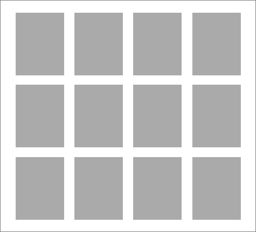
Equally sized Content Types within the AGW - designate within AGW creation page.

agw-wireframe-wrapping

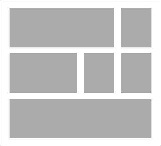
Content Types that are different widths of the AGW - designate in Content Type creation page.

agw-wireframe-fraction

Spacing between each item within the AGW is 34px.

agw-wireframe-wrapping-fraction

Default margin-bottom is 60px.

agw-wireframe-fraction-spacing

This is the Advanced Grid Wrapper creation page with some instructions on each input
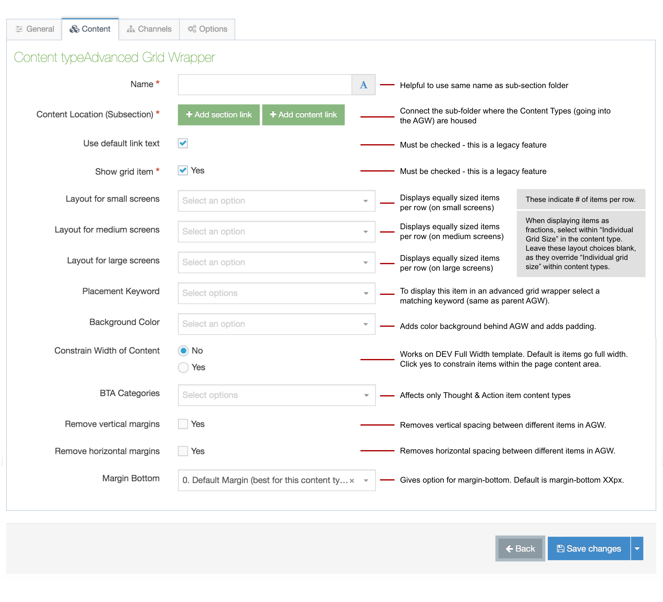
AGW instructions


In each Content Type that goes into the AGW, fill out these two inputs...

agw-content-type-page


The Best Content Type for Adding Text to a Page

The General Content Block is a newer version of the General Content content type. The General Content Block (GCB) will ideally replace instances of General Content and Grid Item content types. It goes into the Advanced Grid Wrapper (AGW) and can add text and image. Below is an example of 4 GCBs within an AGW.

Image of mountains 600 x 400

Grid Cell Item group 2

Optional Subtitle

Default font sizing entails: header 24px for desktop, tablet and mobile; body text is 20px, with a margin-bottom: 30px; card padding: 25px 20px 20px 20px.

The Advanced Grid Wrapper can now be placed just below the Header or just above the Footer like other heros or sub-footer items, but this means any content type that goes within the AGW can be placed in these locations (with or without content contrained).

Goes in: .edu in main content area (+ Header and Footer sub-sections)
To place in main content area: see instruction page >> 
Margin-bottom: 6rem (has margin-bottom options)

Steps to add the AGW to the Header:

  1. Create a child section (sub-section) under the parent section (main content area) of the page.
    1. Naming suggestion: Section Header (but the name doesn’t matter)
  2. In the child section, add an Advanced Grid Wrapper content type.
    1. Set a placement keyword (e.g., “Grid Group 1”).
    2. Set the section link to the location the AGW is loaction in itself. (e.g., Section Header)
    3. Set the “margin bottom” to zero.
  3. In the child section, also add the content types to be shown within the AGW.
    1. Set the same placement keyword as the AGW (e.g., “Grid Group 1”).
  4. In the parent section (main content area), add a content type “Section Header Container
    1. Set the same placement keyword as the AGW it is connecting to (e.g., “Grid Group 1”)


To add the AGW to the Footer (same as above, except the naming):

  1. Create a child section (sub-section) under the parent section (main content area) of the page.
    1. Naming suggestion: Section Footer (but the name doesn’t matter)
  2. In the child section, add an Advanced Grid Wrapper content type.
    1. Set a placement keyword (e.g., “Grid Group 2”).
    2. Set the section link to the location the AGW is location in itself. (e.g., Section Footer)
    3. Set the “margin bottom” to zero.
  3. In the child section, also add the content types to be shown within the AGW.
    1. Set the same placement keyword as the AGW (e.g., “Grid Group 2”).
  4. In the parent section (main content area), add a content type “Section Footer Container
    1. Set the same placement keyword as the AGW it is connecting to (e.g., “Grid Group 2”)

Within the new page templates, any content type, that can be placed within the Advanced Grid Wrapper, can now be placed just below the Header or just above the Footer like other heros or sub-footer items without content constrained.
Note: Hero Images still need to placed within a sub-section called Page Header.

Steps to add content types to the Header:

  1. Create a child section (sub-section) under the parent section (main content area) of the page.
    1. Naming suggestion: Section Header (but the name doesn’t matter)
    2. In the child section, add the content types to be shown under the Header
      1. Set the same placement keyword to each item (e.g., “Grid Group 1”).
  2. In the parent section (main content area), add the content type “Section Header Container
    1. Set the same placement keyword as the content types it is connecting to have (e.g., “Grid Group 1”)


To add content types to the Footer (same as above, except the naming):

  1. Create a child section (sub-section) under the parent section (main content area) of the page.
    1. Naming suggestion: Section Footer (but the name doesn’t matter)
    2. In the child section, add the content types to be shown above the Footer
    3. Set the same placement keyword to each item (e.g., “Grid Group 2”).
  2. In the parent section (main content area), add a content type “Section Footer Container
    1. Set the same placement keyword as the content types it is connecting to have (e.g., “Grid Group 2”)