Cards

Goes in: .edu main content area + Advanced Grid Wrapper
Margin-bottom: 6rem (with margin-bottom options)

Has options for:

  • Background color
  • Top border

November

1

Early Decision I Early Action


For students applying Early Decision I or Early Action

November

1

Early Decision I Early Action


For students applying Early Decision I or Early Action link

November

1

Early Decision I Early Action >>


For students applying Early Decision I or Early Action

November

2-12

Multiple Days - Using Smaller Day Text


For students applying Early Decision I or Early Action

See Examples >>

Goes in: .edu main content area + Advanced Grid Wrapper
Margin-bottom: 6rem (with margin-bottom options)

Has options for:

  • Background color or background image
  • Top border
bob wittstein

Profile Name Large 36 | tab + mobile 30px

Title 20 | tablet + mobile 18px

Large Desktop 18 | tablet + mobile 14px. Horizontal Card 2 or more card sin a row. Lorem ipsum dolor sit amet, consectetur adipiscing elit, sed do eiusmod tempor incididunt ut labore et dolore magna aliqua. Ut enim ad minim veniam, quis nostrud Weather Channel ullamco laboris nisi ut aliquip .

bob wittstein

Profile Name Small desk 30 | tab + mob 26px

Title desktop 18 | tablet + mobile 16px

Small Text Description - desktop 16 | tablet + mobile 14px. Verical Card. Lorem ipsum dolor sit amet, consectetur adipiscing elit, sed do eiusmod tempor incididunt ut labore et dolore magna aliqua. Ut enim ad minim veniam, quis nostrud exercitation ullamco laboris nisi ut aliquip ex ea .

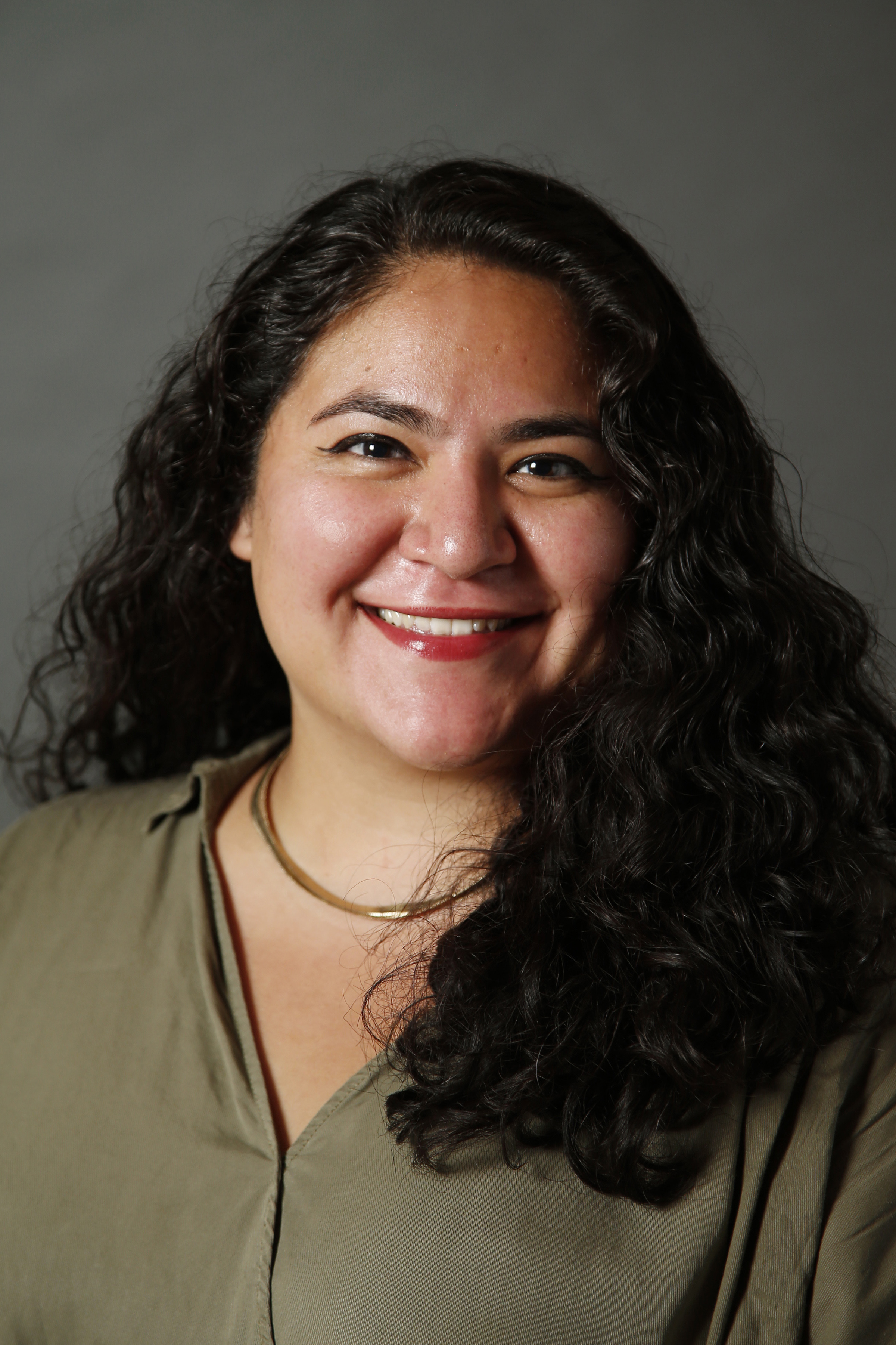
Cassandra Flores-Montano

Profile Name Large 36 | tab + mobile 30px

Title 20 | tablet + mobile 18px

CEDAR KEY LT BG Large Desktop 18 | tablet + mobile 14px. Horizontal Card 2 or more card sin a row. Lorem ipsum dolor sit amet, consectetur adipiscing elit, sed do eiusmod tempor incididunt ut labore et dolore magna aliqua. Ut enim ad minim veniam, quis nostrud Weather Channel ullamco laboris nisi ut aliquip .

See Examples >>

Goes in: .edu main content area + Advanced Grid Wrapper
Margin-bottom: 6rem (with margin-bottom options)

Has options for:

  • Background color or background image
  • Top border
  • Stat text sizes
  • Stat color
  • Body text sizes
    • Body text color can be chosen manually within TinyMce

Notes

  • links in the body text will be the Summer Nights blue unless a different color is chosen manually within the TinyMce.
  • The Stat counter works best when it below the fold on the page the counter the starts when the page scrolls.

Guidelines For Use

  1. Max characters are meant for full width page layouts, as 2 col + 3 col are going away. If these are placed on 2 column page layouts, please use fewer digitsor a smaller text size to accommodate for less width.

    1. Stat max character count is 7 (ex., 6 numbers and 1 $)

    2. Body text max character count should be around 200 (but input will allow for more to add for formatting and links)

  2. When cards are 4-up at Desktop

    1. Stat text size - use small size (medium could fit for low digit count)

    2. Body text size - use discretion based on text amount (cards can get very long at smaller widths)

    3. Card at mobile must be 2-up or 1-up

  3. When cards are 3-up at Desktop

    1. Stat text size - use medium or small (large could fit for low digit count)

    2. Body text size - use discretion

    3. Card at mobile must be 2-up or 1-up

  4. When cards are 2-up at Desktop

    1. Stat text size - can be any size (small, medium or large)

    2. Body text size - use discretion

    3. LARGE cards must be 1-up at MOBILE

      1. This is because the text size is designed to be large, and therefore wouldn’t fit on 2-up at mobile)


100
%

is when you’ll begin to experience a full business school education, blended with the liberal arts and sciences. Link

80%

BG is when you’ll begin to experience a full business school education, blended with the liberal arts and sciences

 Card - Simple + Navigation Cards are very similar, but one main difference is...

  • Card - Simple has body text the can have links and has an optional button for a link
  • Navigation Card is a button as a whole. When the card has a link. Upon hover, the cards scale a little larger and  can be clicked anywhere on the car to go to one link. Also, the text can not indiviually have links.


Placement Instructions

card instructions 1


card instructions 2


Card instructions 3

Goes in: EDU + Portal main content area + Advanced Grid Wrapper
Margin-bottom: 6rem (with margin-bottom options)
Spans width: 100% of container it is in
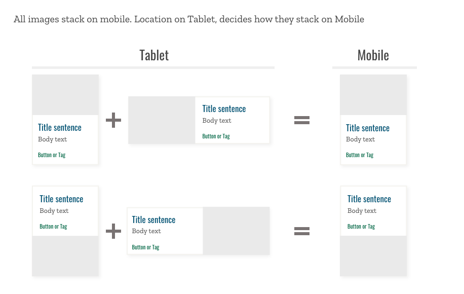
Note: if the card is too thin where the image isn’t really visible, the width may not work well (due to the text and the image fighting to fill the space that card is allotted) and the card should be stacked at that point
Note: images may look stretched on Internet Explorer

Has options for:

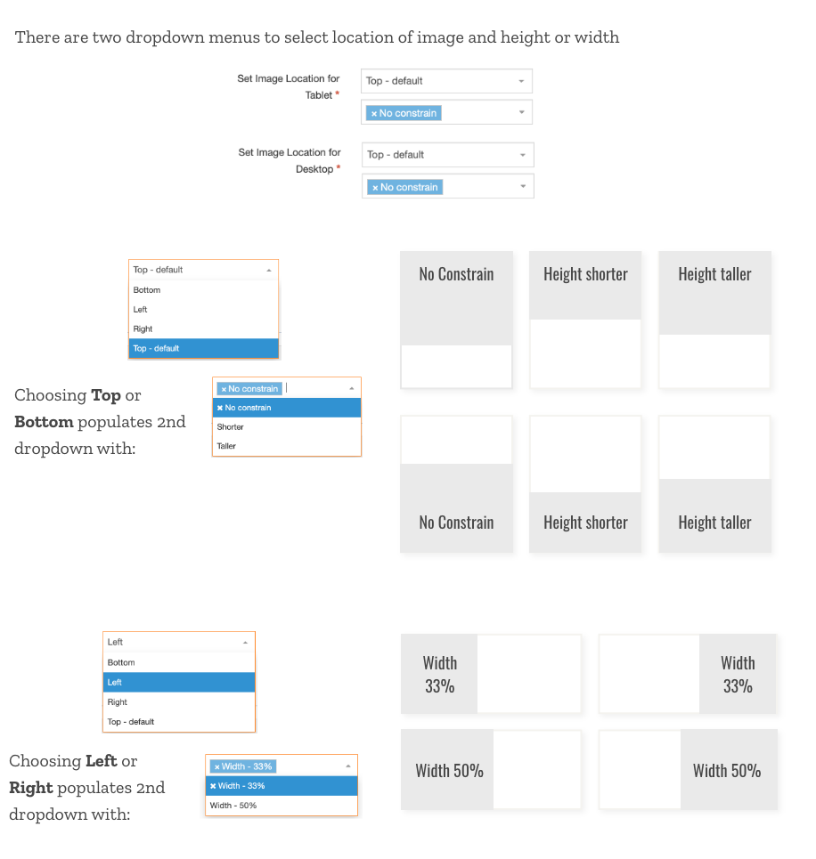
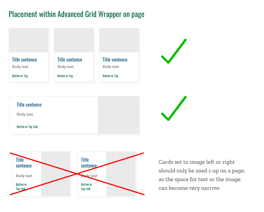
  • Image and image placement - top or bottom (with control over height) and left or right (with control over width). Note: when placed outside AGW, only place image on left or right as card will span 100% of container and will be too wide.
  • Background color
  • Top bar and top bar color
  • Button styling
  • Has additional TinyMCE as an option under the Body Text Input (both are optional). TinyMCE allows for body text to have links.
  • Font Sizing options (in groups, see below)


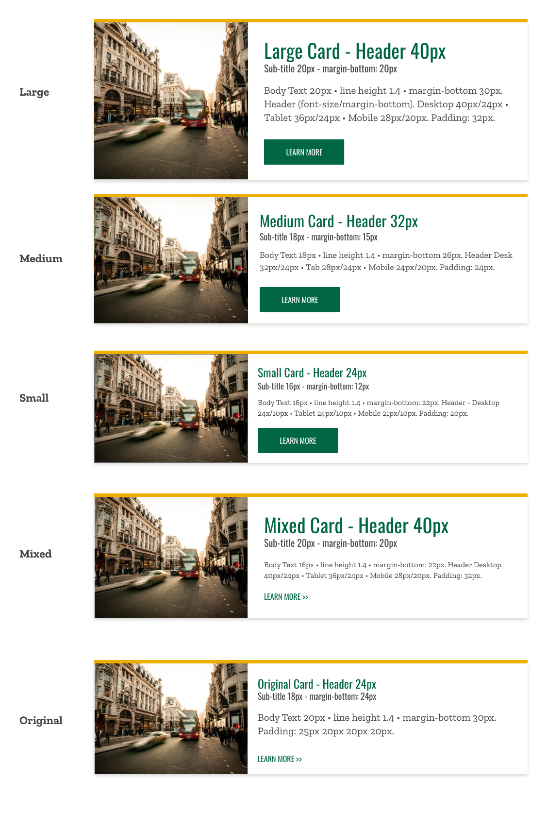
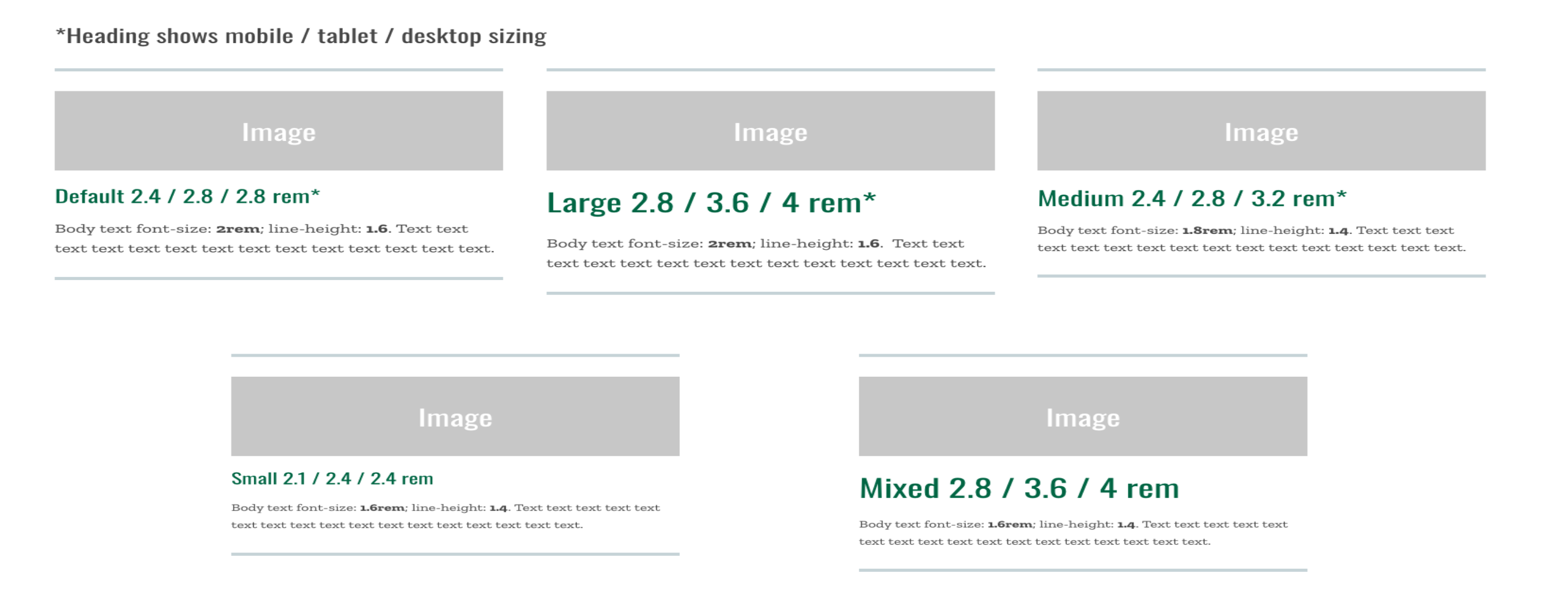
Font Sizing Options Card - Simple font sizing options

Image of mountains 600 x 400

Title - Large 40px desktop | 36px tablet | 28px mobile

Optional Subtitle 20px

Body Text for large font sizing is 18px. CEDAR KEY LT BG

Image of mountains 600 x 400

Title - Medium 28px desktop | 26px tablet | 26px mobile

Optional Subtitle 18px

Body text for medium font sizing is 16px. Link

Image of mountains 600 x 400

Title - Small 22px

Optional Subtitle 18px

Body text for small font sizing is 14px

Image of mountains 600 x 400

Title Mixed - 40px

Optional Subtitle 20px

Body Text for mixed font sizing is 16px

Image of mountains 600 x 400

Title - Small 22px

Optional Subtitle 18px

Body Text for large font sizing is 14px. CEDAR KEY LT BG

Image of mountains 600 x 400

Card Simple

Left 25%
Image of mountains 600 x 400

Card Simple

Left 33%
Image of mountains 600 x 400

Card Simple

Left 50%
Image of mountains 600 x 400

Card Simple

Left Unconstrained
Image of mountains 600 x 400

Card Simple

Right 33%
Image of mountains 600 x 400

Card Simple

Right 50%
Card Simple in Dropdown

Card Simple to be placed within Dropdown Menu. Radio Button "Is Being Placed in Dropdown Menu" below is checked "yes".

Goes in: .edu main content area + Advanced Grid Wrapper
Margin-bottom: 3rem (with margin-bottom options)
Spans width: 100% of container it is in
Note: if the card is too thin where the image isn’t really visible, the width may not work well (due to the text and the image fighting to fill the space that card is allotted) and the card should be stacked at that point
Note: images may look stretched on Internet Explorer

Has options for:

  • Image and image placement - top or bottom (with control over height) and left or right (with control over width). Note: when placed outside AGW, only place image on left or right as card will span 100% of container and will be too wide.
  • Top bar color (default top color mango) and top bar hover color
  • Button styling Note: if button not chosen, card has no hover
  • When card is has link, whole card is button
  • Note: Needs to be placed in AWG to float next to other cards

See Instructions and options >>
Goes in:
.edu main content area + Advanced Grid Wrapper
Margin-bottom: 6rem (with margin-bottom options)
Note: Only use background colors that provide enough contrast with the text color used. For color contrast combinations see the Colors page.

Has options for:

  • Image
  • Top border
  • Bottom border
  • Font sizes

Aside Card Specs


Goes in: EDU + Portal main content area + Advanced Grid Wrapper
To place in page: place Card Slider Wrapper and Card Slider Cards (underneath) in main content area (cards can also be placed within a sub-section, but do not need to be in a sub-section to work)
To Place in AGW: Wrapper and cards need to be in child sectionunder AGW. The cards themselves do not go into the AGW (they do not have keyword Placement dropdowns). The Card Slider Wrapper brings the cards in, as long as the Keyword Placement dropdown matches the keywords in the AGW. See example in AGW >>

Margin-bottom: 6rem (with margin-bottom options)

Note: When using a 2 Column Layout with more than 2 cards across, and adding bulleted text, the text may run off the page. Be sure to set more than 2 cards across at Tablet.

Note: Make sure the dropdown indicating how many cards across at tablet and desktop is chosen within the Card Slider Card Wrapper CT. If the dropdown is not chosen, cards make stack instead of being a slider.

Has options for:

  • Amount of cards across at tablet and desktop. This is a dropdown that is within the Card Slider Card Wrapper content type.
  • Body text size. There are now 2 sizes that can be chosen from a dropdown for the body text (17px or 20px). The font is always Oswald (sans-serif) within this content type.
  • Images placed on th ecard via teh Media Input will sit at the top of the card and will be flush with the cards edge.
  • Images placed within the TinyMce will sit inside the card and have padding around it.


Jira ticket: ITCMS-2951 to merge with Differentiator Card (+ wrapper) + add sections to make like Capital Markets Progress Report
Image of mountains 600 x 400

Heading 3 with Link

Body text size medium link.

Heading 3

Heading 4

Body text medium size.

  1. Test bullets
  2. Test bullets
    1. Test bullets
Image of mountains 600 x 400

Heading 3

Heading 4

Body text large size.

  • Test bullets link
  • Test bullets
    • Test bullets

Babson Alumni Reception


March 7, 2020

(Dubai, UAE)

Join Babson's Middle East Alumni Club as they kick off the new year with a casual evening reception, hosted at the home of Aman Nanda '13.

Image of mountains 600 x 400

Heading 3

Heading 4

Body text medium size.

Goes in: .edu main content area + Advanced Grid Wrapper
To place in page: place Differentiator Wrapper and Differentiator Cards in main content area (cards do not need to be in sub-section)
To place in AGW: Wrapper needs to be in child section, under where ADW is, and cards can be in same folder. The cards themselves do no go into the AGW alone, but the Wrapper needs to have the Keyword Placement dropdown match AGW Keyword placement in parent section.
See example in AGW >>

Margin-bottom: 6rem (with margin-bottom options)

All Differentiator Cards stack on tablet and mobile.

Note: Before using large text, make sure it fits in its container on tablet and mobile device. Large text can overflow from the box it is in. Using an image as the text allows the text to be responsive.
Use image for large number instead of Hero Stat input if cards will be placed in Advanced Grid Wrapper that takes up less then 100% of the row. 

Student Consulting Projects

400+ Babson graduate students participate in student consulting projects across 80+ partner organizations each year.

Starting Salary MBA

Starting salary for 2018 Babson MBA graduates

Goes in .edu: main content area + Advanced Grid Wrapper
Margin-bottom: no margin-bottom as usually sits within wrapper
Inside Advanced Grid Wrapper Spans width: 100% of container it is in
Outside AGW: max-width: 57rem

Has option for:

  • divider line to appear on right side
Placed Inside AGW

Title

Division
Image of mountains 600 x 400

Experts

Expert

Division

Title

Division

Goes in .edu: main content area + Advanced Grid Wrapper
Margin-bottom: no margin-bottom as usually sits within wrapper
Inside Advanced Grid Wrapper Spans width: 100% of container it is in
Outside AGW: max-width: 57rem

Has option for:

  • background color
Placed Inside AGW
Image of mountains 600 x 400

Body text goes here.

Author Name, Title, Company
Image of mountains 600 x 400

Body text goes here.

Author Name, Title, Company
Image of mountains 600 x 400

Body text goes here.

Author Name, Title, Company

Goes in .edu: main content area + Advanced Grid Wrapper
Margin-bottom: no margin-bottom outside of AGW as usually sits within wrapper
Inside Advanced Grid Wrapper Spans width: 100% of container it is in
Outside AGW: max-width: 57rem

Placed Inside AGW
Image from article

Thought and Action - in AGW

At a campus wide community meeting on Thursday, College leaders gathered with students, faculty, staff, alumni, and governance to share updates on strategic planning efforts, and share the vision for Babson's bold future. "There is disruption in the marketplace that, for a lot of people, is scary," said President Stephen Spinelli Jr.

Babson Thought & Action